Turned a stadium's scattered department tools into one system
Replaced years of workarounds with one platform.

NDA Notice
Client name and visual identity have been altered per NDA, and some details had to be left out. Everything shown here is real.
The context
The system behind the venue
This is a multi-tenant B2B SaaS platform for running stadium and event-venue operations, covering booking, contracting, and finance all in one system. The first tenant is one of the largest arenas in its city, operated by an international venue-management company that handles everything the audience never sees.
Client: NDA via Adroit Group
Role: Product Designer
Scope: Research, End-to-end Product Design, Design System
Duration: 8 months
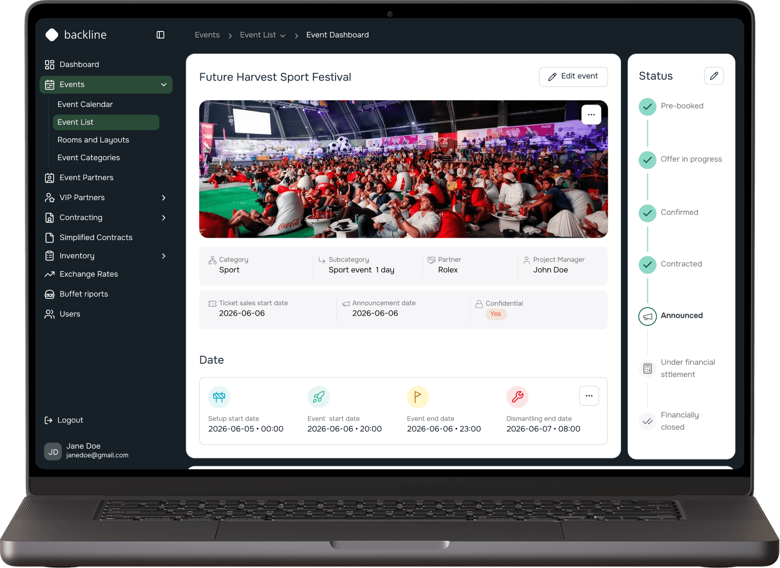
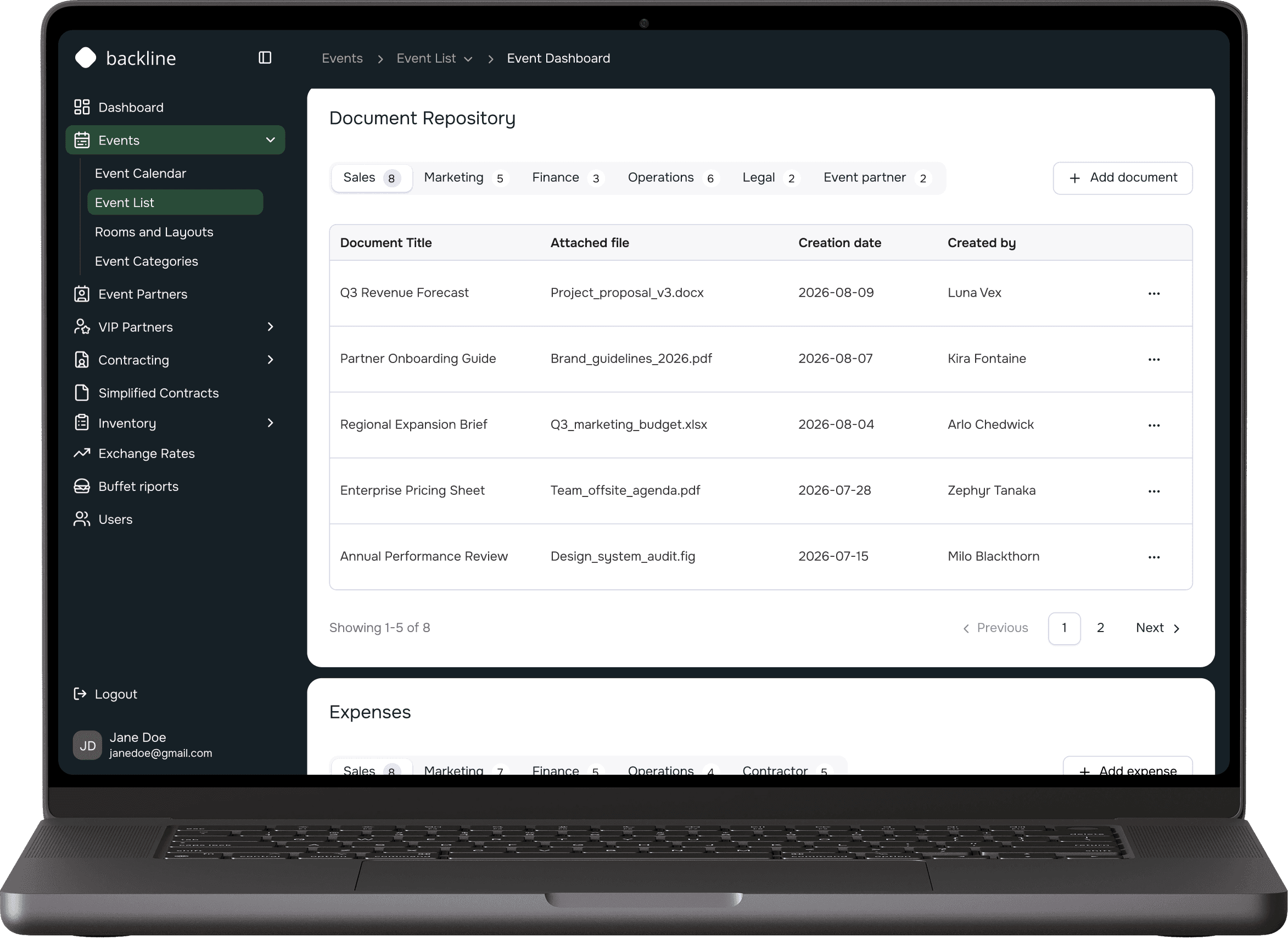
Event dashboard. Navy chrome, light workspace: the split that kept the brand visible and the numbers readable.
The problem
A system nobody wanted to open
The staff worked with an outdated system that was hard to navigate and full of features nobody used. It only partially covered their actual workflows, so they ended up solving a lot of things outside the system.
Outdated interface
Difficult to navigate
Unused features
Constant workarounds
The goal
Complete, not complicated
A modular, configurable system that serves the needs of a given location. Every department uses the same interface, and permissions determine what each person can see. The next location won't need redesigning, just configuration.
The process
Long discovery before any screens
Audit of old system
↓
→
Department workshops
↓
→
Map actual usage
↓
→
User stories
↓
→
Design (wireframes, prototype, UI)
↓
→
Two-week sprints
↓
→
Testing with real users
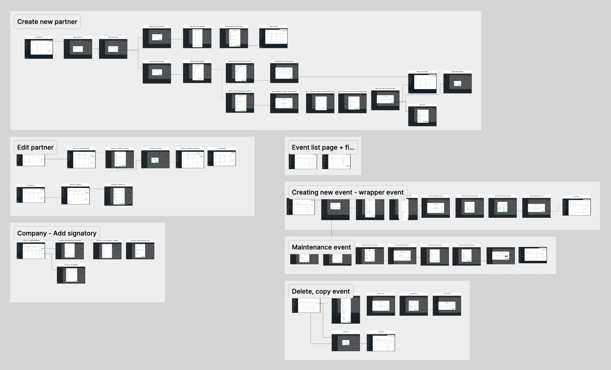
Creating the flows, working through the edge cases. Just a fraction of them.
Core features
Four pillars, everything else revolves around these
The result of months of research into how each part of the system actually gets used.

Partner and user management
Manage partner profiles, their events, contracts, and user access.

Contracting
Auto-generate partner agreements with contract variables pre-filled.

Event organization
See an event's key details and status at a glance, from announced to closed.

Financial calculations
Track expected vs. actual income, costs, and margins per event.
My part
The team included a project manager, six developers, a QA tester, and me as the designer. Research was a close collaboration with the PM, figuring out what each department actually needed. Once the spec, user stories, and architecture came together, design was mine, to pour the flows into.
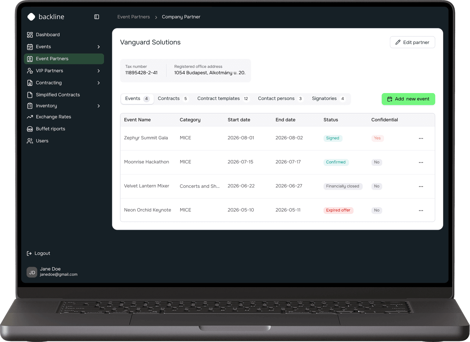
Partner and user management
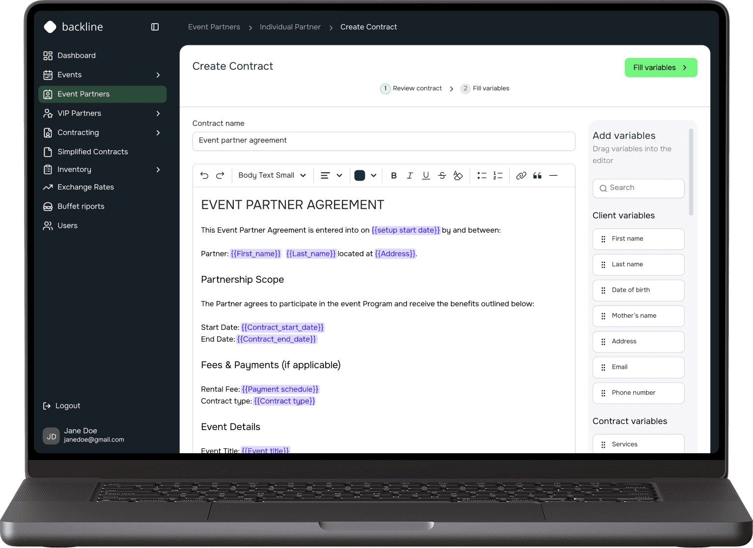
Contracting
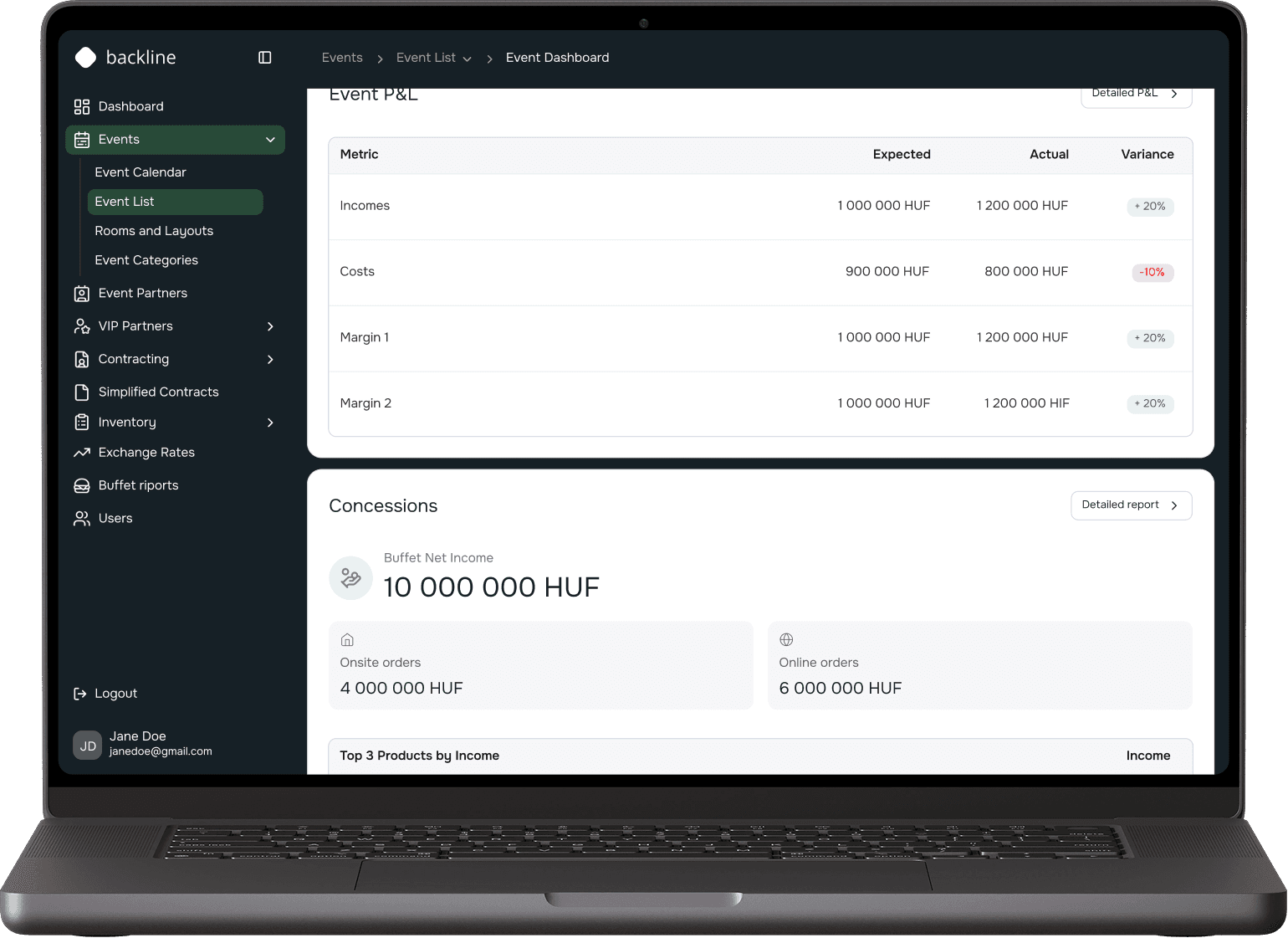
Financial calculations
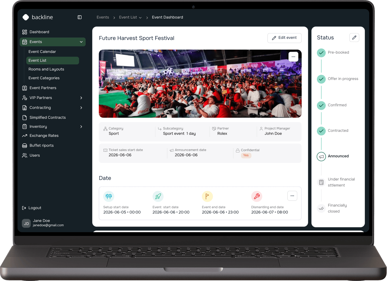
Event organization
Integration of AI
AI in the process, detour into code
I implemented AI into a workflow, not just one-off prompts, running research, copy, and prototyping through it, especially on the event organization and financial calculation pieces, so I could try more versions and brainstorm more freely. But nothing made it into the project without passing through my own judgment first, the same way I used skills as a second pair of eyes, an on-demand check for gaps, typography, consistency, and contrast.
That momentum carried me into GitHub, where I started experimenting with coding myself. One thing led to another, and I ended up vibe coding a few smaller cards, a curiosity that grew naturally out of how closely we already worked together.
Working with developers
We synced daily, in meetings and through a dedicated Slack channel, instead of once a sprint. Risky screens got brainstormed early, either to figure out the build or nail down the purpose, catching issues before they meant a rebuild.
I also kept the developer who owned the design system updated on every custom component, which is why the finished screens still match the designs. That closeness changed how I think, I see design more structurally now and treat trade-offs as part of the job.
The decisions
Tradeoffs and choices
Efficiency vs. Distinctiveness
A ready-made shadcn library meant faster delivery. I restyled it to match the brand and added custom components where needed. As an internal tool, logic mattered more than polish.
Dark brand, light workspace
The client wanted deep navy throughout, but data tables don't survive that: eyes tire fast. I moved navy to the sidebar and header, kept the work area light. Brand shows, numbers stay readable.
Constraints vs. Craft
Only a couple of screens needed mobile at all. I wanted to use cards, better fit than a table but the developer flagged no capacity, so I made small adjustments instead.
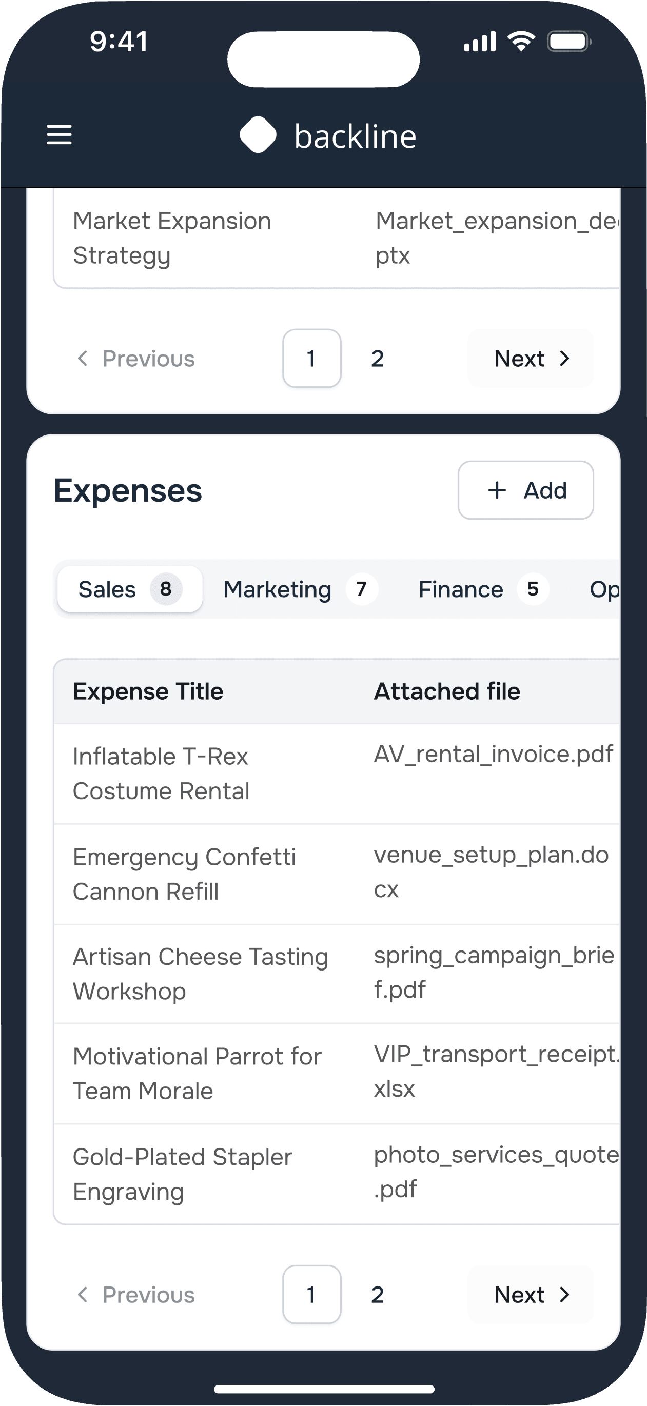
Constraints vs. Craft - What shipped on mobile vs. desktop
The argument I lost, made visible. Cards would've suited mobile better, but there was no capacity for a second pattern. So the table stayed, just tighter and with taller cells so the text fits.
UX decisions
Why does table design UX matter?
Tables are usually the most efficient way to organize complex information, and enterprise software leans on them constantly.
Before drawing a single column, I ask four things:
- what type of data goes in the cells
- are people scanning and comparing or actively editing
- what device they're on
- and whether the table needs to be actionable at all, or just read-only.
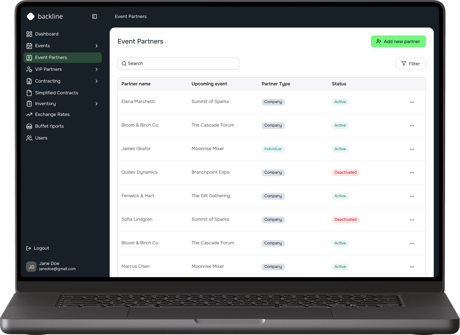
Event Partners
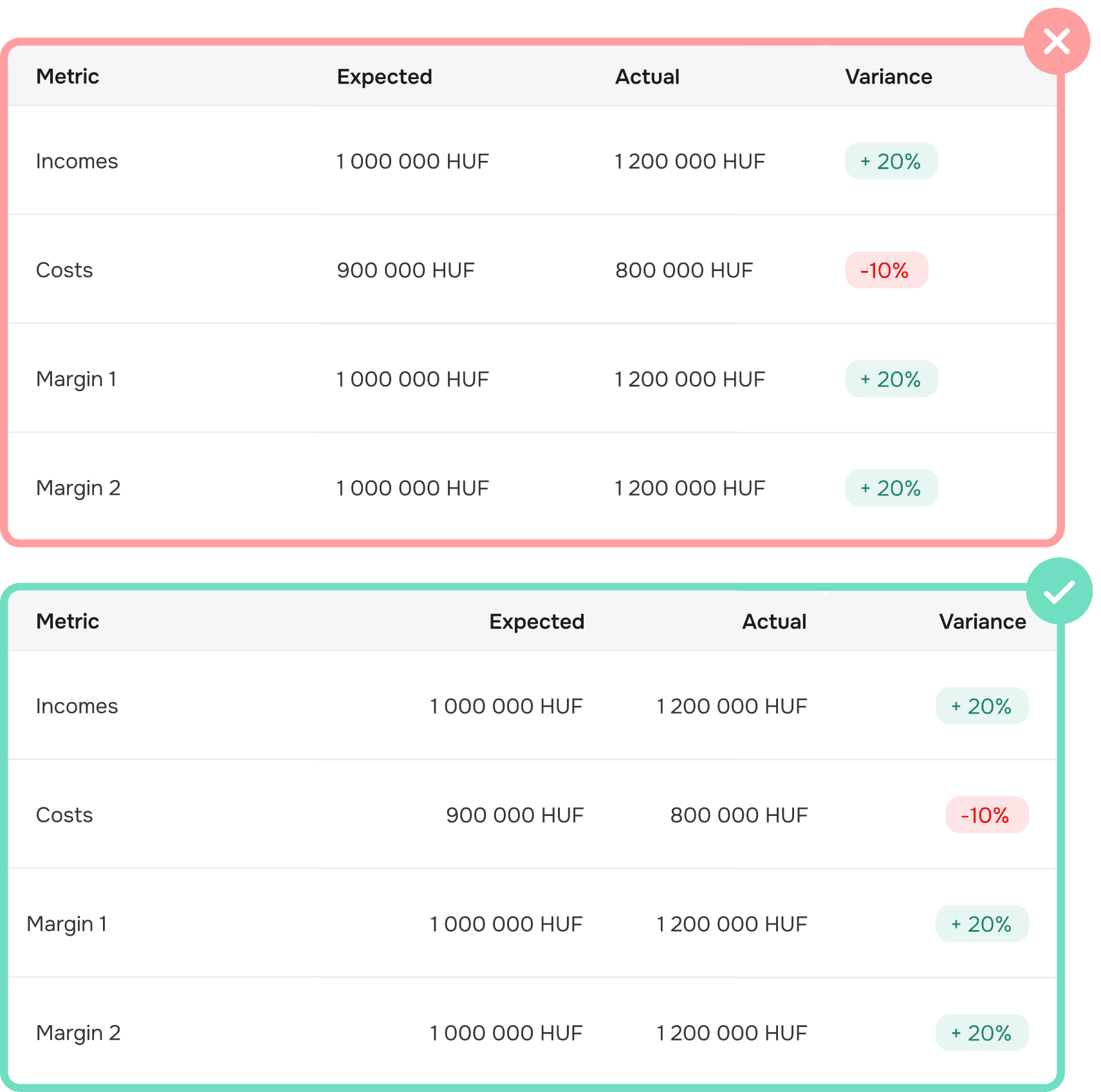
Right-align numeric columns
Unlike text, numbers are easier to compare when right-aligned, since it lines them up by decimal position and makes differences easy to spot.
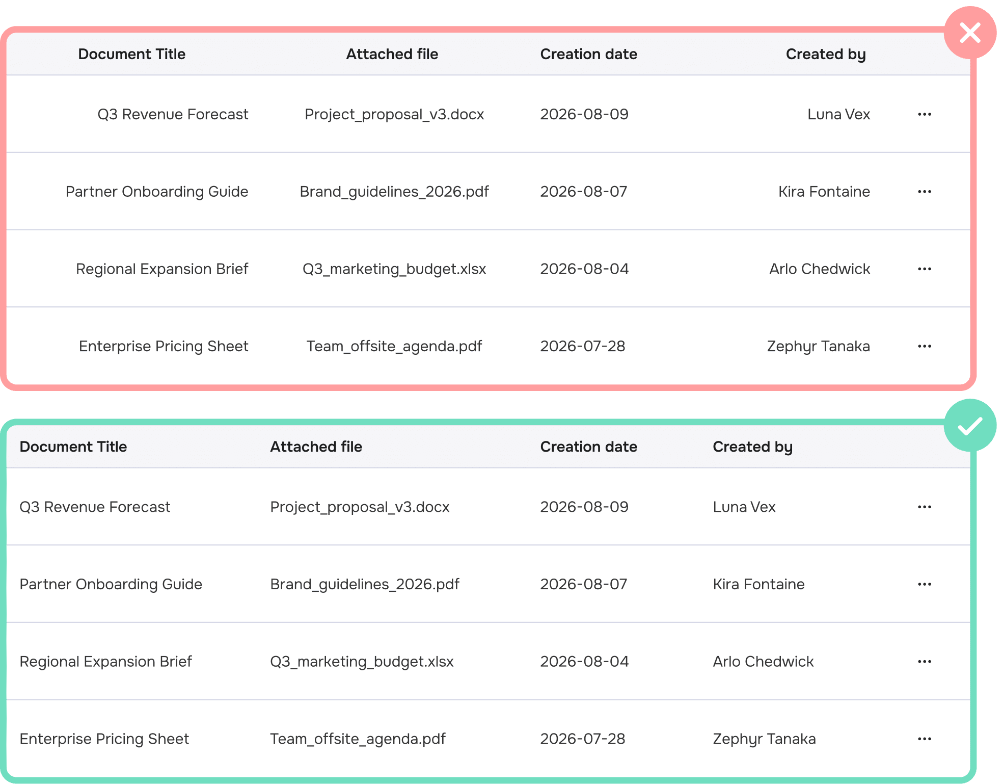
The exception is qualitative numbers you wouldn't do math on: dates, zip codes, phone numbers. These read better left-aligned, especially when that column comes first. True quantitative values (money, measurements, percentages) should stay right-aligned.
Left-align text columns
Text columns should always be left-aligned, since that's how we naturally read, from left to right. Headers should match the alignment of their column content: mismatched alignment creates awkward whitespace and unnecessary visual noise.
Center alignment should be avoided altogether, as it breaks scanning and makes it harder to compare rows or spot outliers at a glance.
UI decisions
Interface and branding
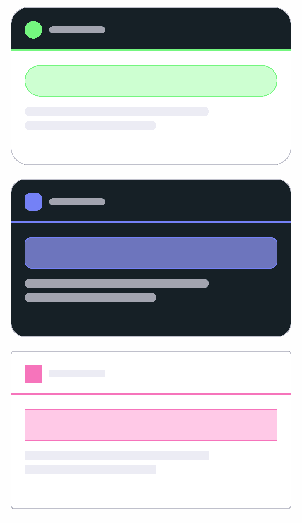
Since this is under NDA, the colors shown here have been recolored and don't reflect the real palette. That's the whole point of a whitelabel product: anyone can make it their own.
The client's brand elements, color palette, and typography made the platform feel like their product, not a template. Their pattern shows up in the navigation, their color as the accent.
The design system was adapted to the stadium's identity too, shapes and details, not just color. That's what makes it feel like their own product.
Same product, tailored
Outcome
In testing at the pilot venue
It isn't live yet, still in testing with real users at the pilot venue. Even at this stage, the internal team has flagged that day-to-day tasks feel faster and easier than the old process, which is the kind of signal I trust more than a survey score. A few small things came back that needed fixing too, which is exactly what testing at this stage is supposed to surface. The rollout is deliberately narrow for now, get this one venue right before it becomes the template for others.
Replaced department tools and spreadsheets with one system.
Automatic tracking, accurate down to the penny.
One design system underneath, built to scale into a white-label base for other venues.
“The old system was an engine full of oil stains. Now we have a nice car that actually drives well.”
The client
What it taught me
System over screens
This project pushed me past pure visual design into systems thinking. Tables, tokens, and structure ended up carrying more weight than any single screen.
Designing for the user who isn't in the room
Event Partners share the same shell as internal staff, so every screen had to work for someone with a fraction of the context and a fraction of the access, without turning into a separate, dumbed-down app.
Checking feasibility before I get attached
Working daily with developers taught me to check feasibility before I got attached to a direction, not after. It changed how early I bring engineering into a decision, as part of shaping the direction itself, not a gate at the end.
